Skip to content
Choosing the right color for your kitchen is one of the most crucial, and perhaps most inspiring, decisions in a kitchen renovation. The color sets the tone for the whole room and affects the light, the feel and how you experience your home every day. Should it feel cozy and warm, airy and fresh, or perhaps bold and full of character?
This guide offers guidance on how to think about color in the kitchen – based on style, light, architecture and lifestyle. We share our top tips, highlight common pitfalls and show you how the right color can help you create a kitchen that feels as functional as it does beautiful.
And of course, if you want support in your color choices, we are here. At Stiligt, we help you visualize, choose and realize a color scheme that feels right.
Choose the right color for your kitchen
The color of the kitchen affects more than we often think – it determines how the room looks, how we feel and how the rest of the home harmonizes with the kitchen. When choosing a color, think above all about what you want the room to radiate and how the color interacts with materials, style and mood.
Here are some general guidelines:
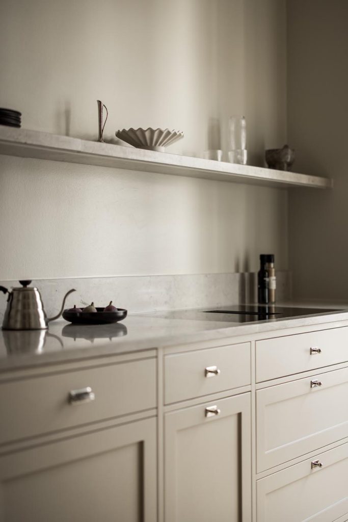
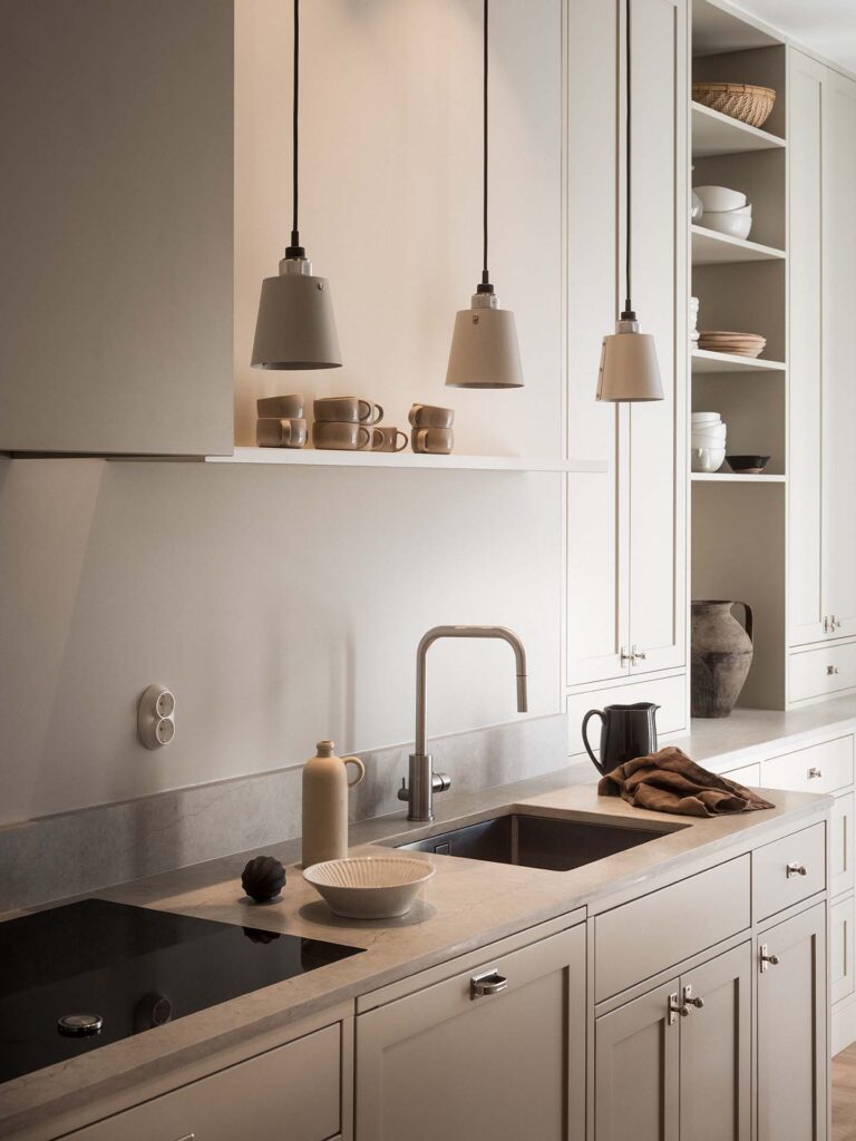
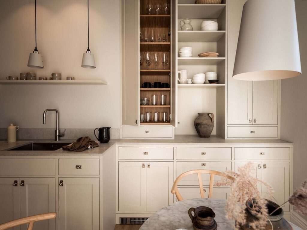
Light tones
Examples: cream, light gray, beige, warm white
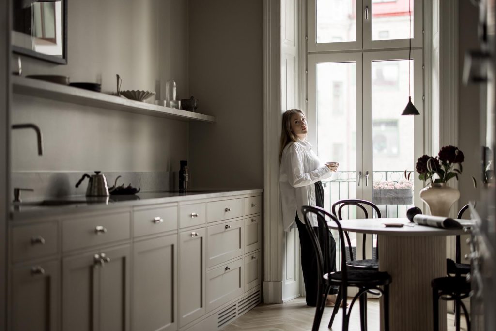
Light colors create a sense of openness, calm and freshness. They are perfect for those who want a clean kitchen where the color serves as a backdrop to other details – such as fittings, worktop or textiles. They work particularly well in classic and Scandinavian styles.
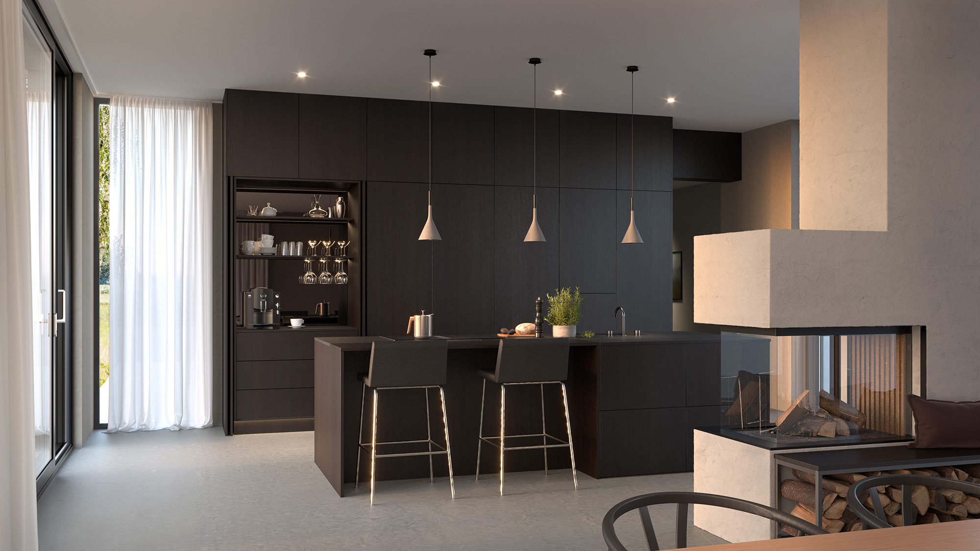
Dark tones
Examples: dark gray, forest green, navy blue, black-brown
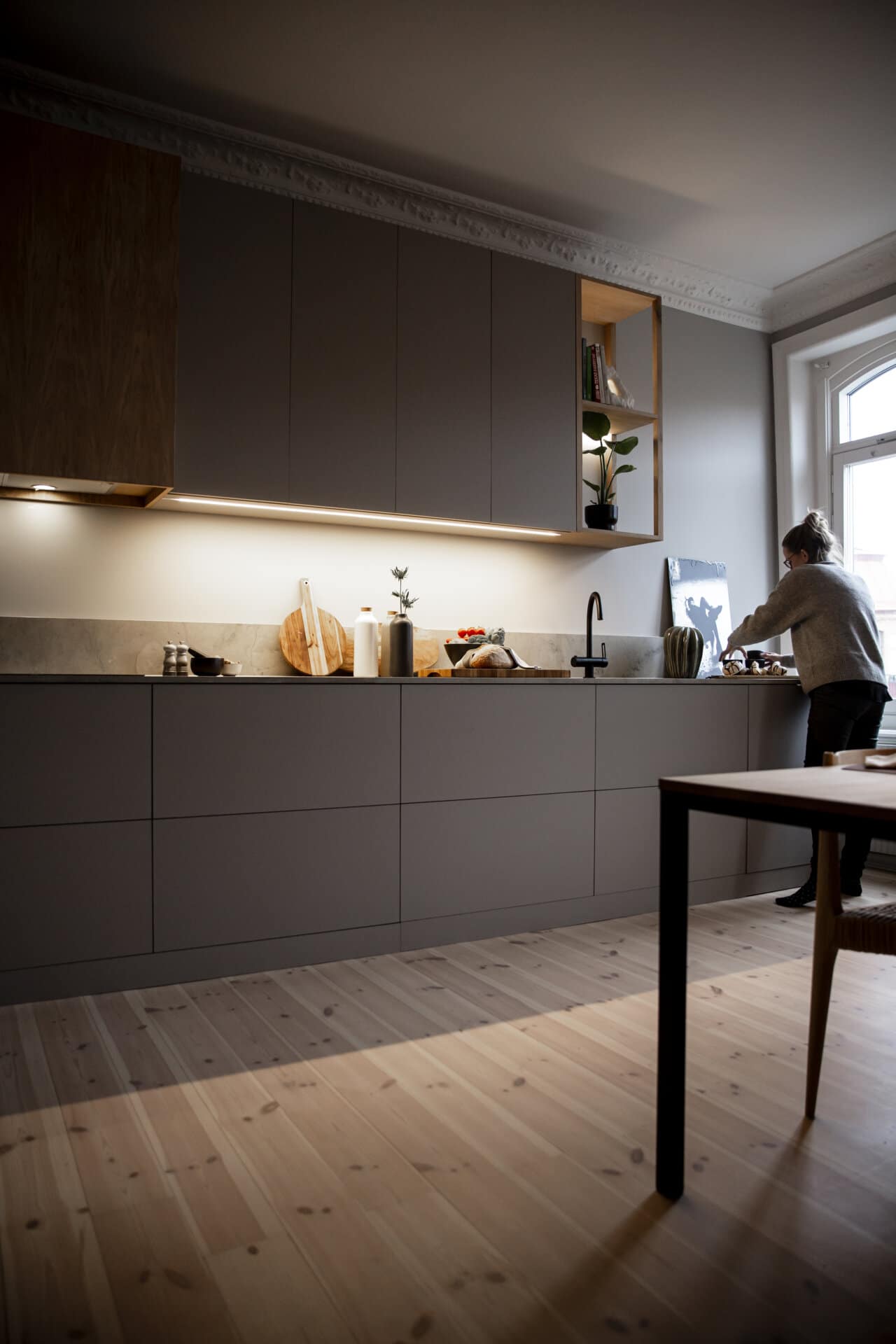
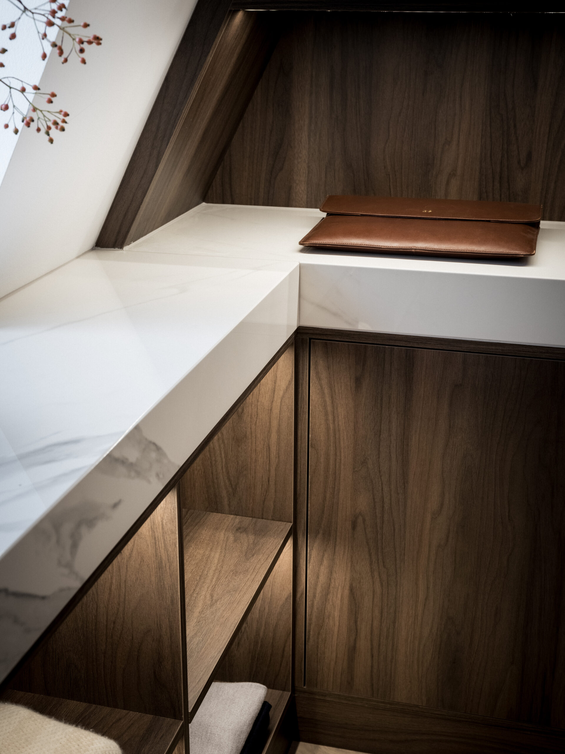
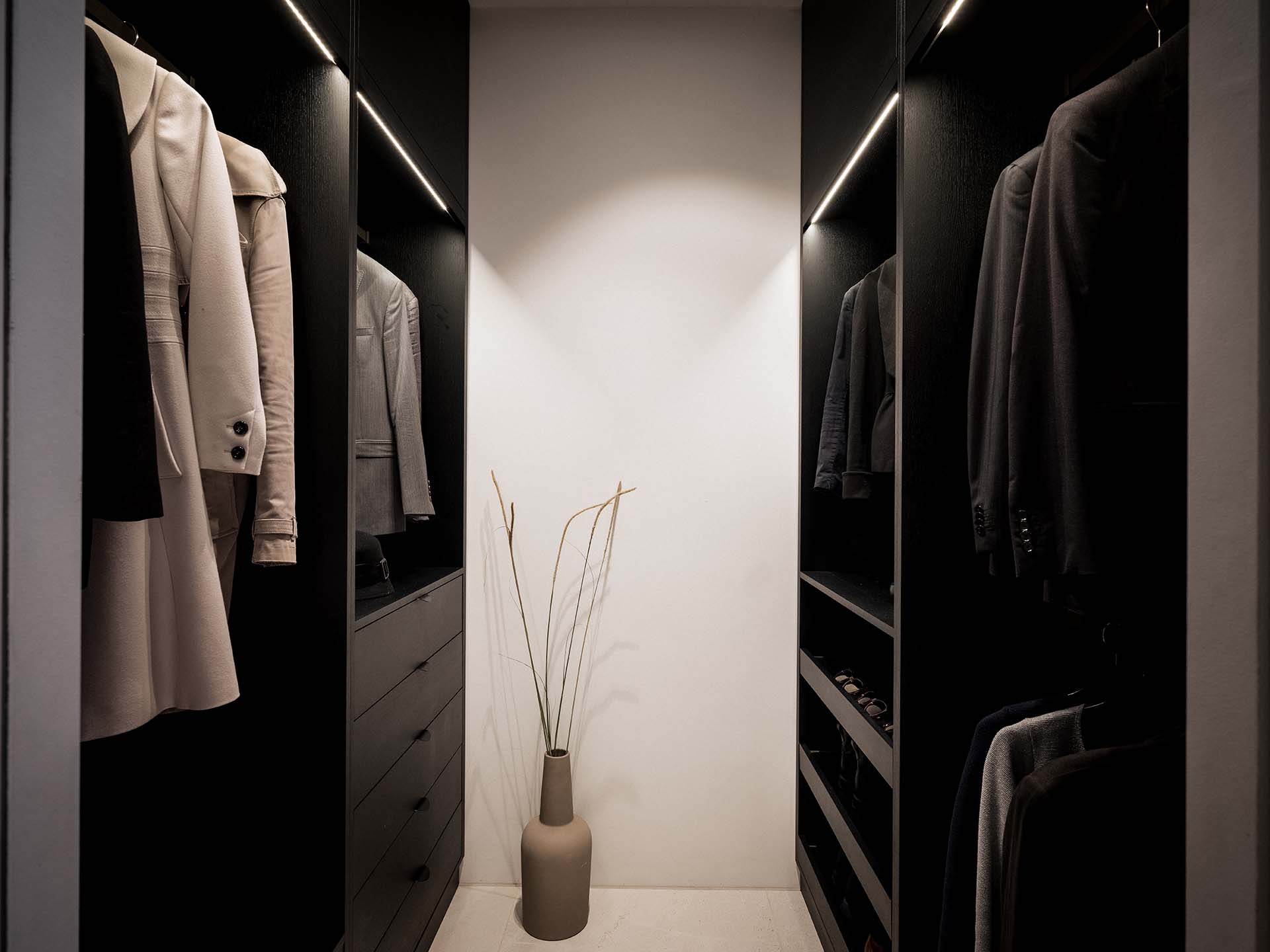
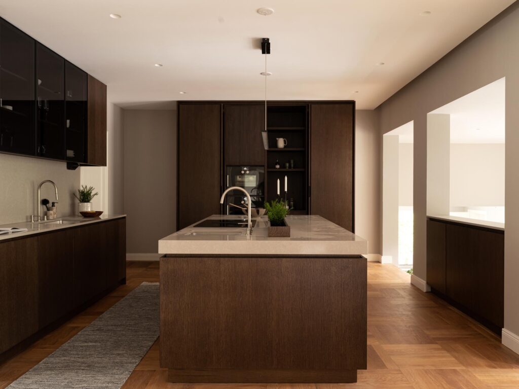
Deep colors give the kitchen an exclusive and cozy feel. They work particularly well in modern, minimalist or industrial kitchens – and in homes where you want to add drama and character. Keep in mind that they often work best in combination with warm materials like wood or brass, so as not to feel too austere.
Neutral tones
Examples: greige, warm gray, sand, taupe
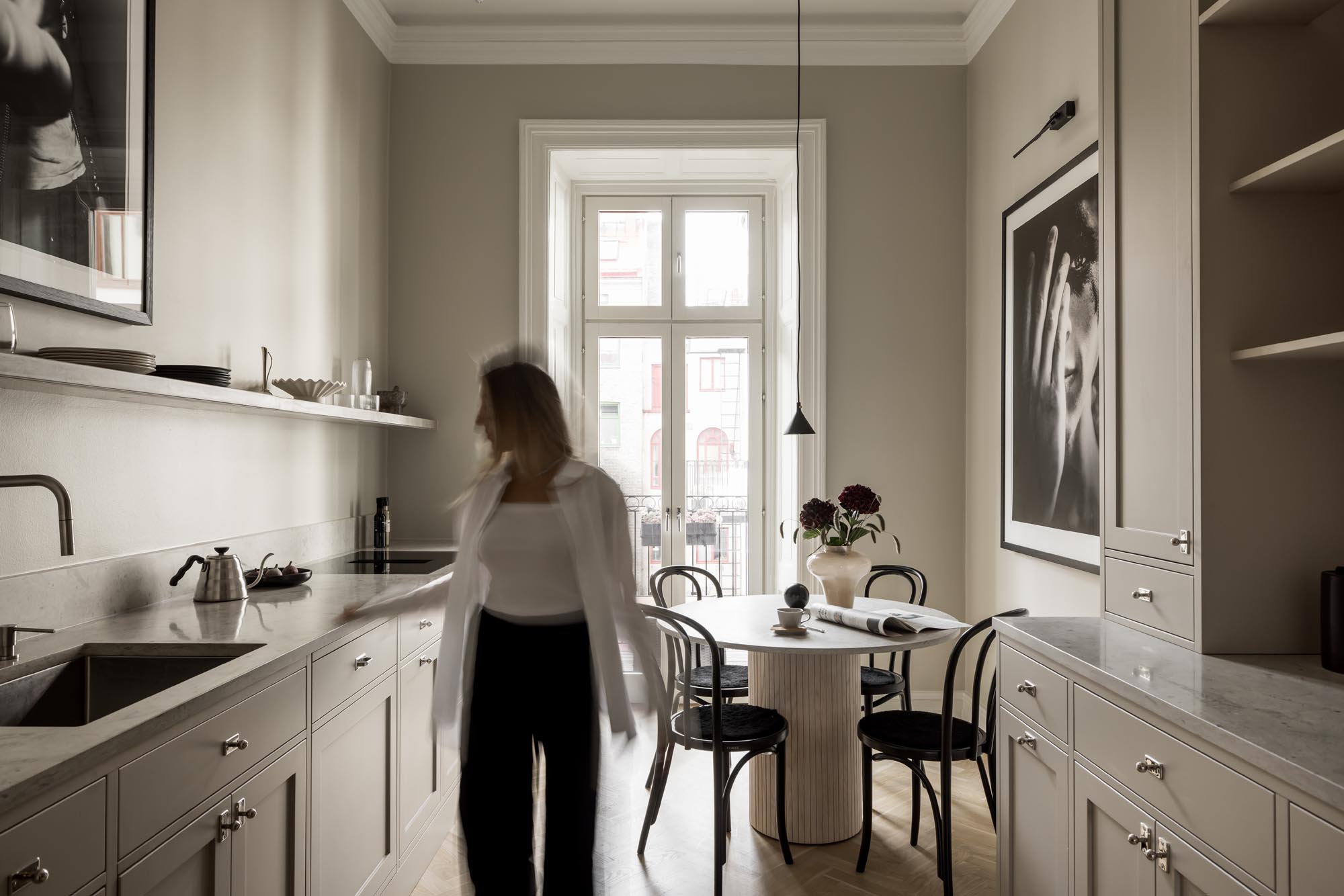
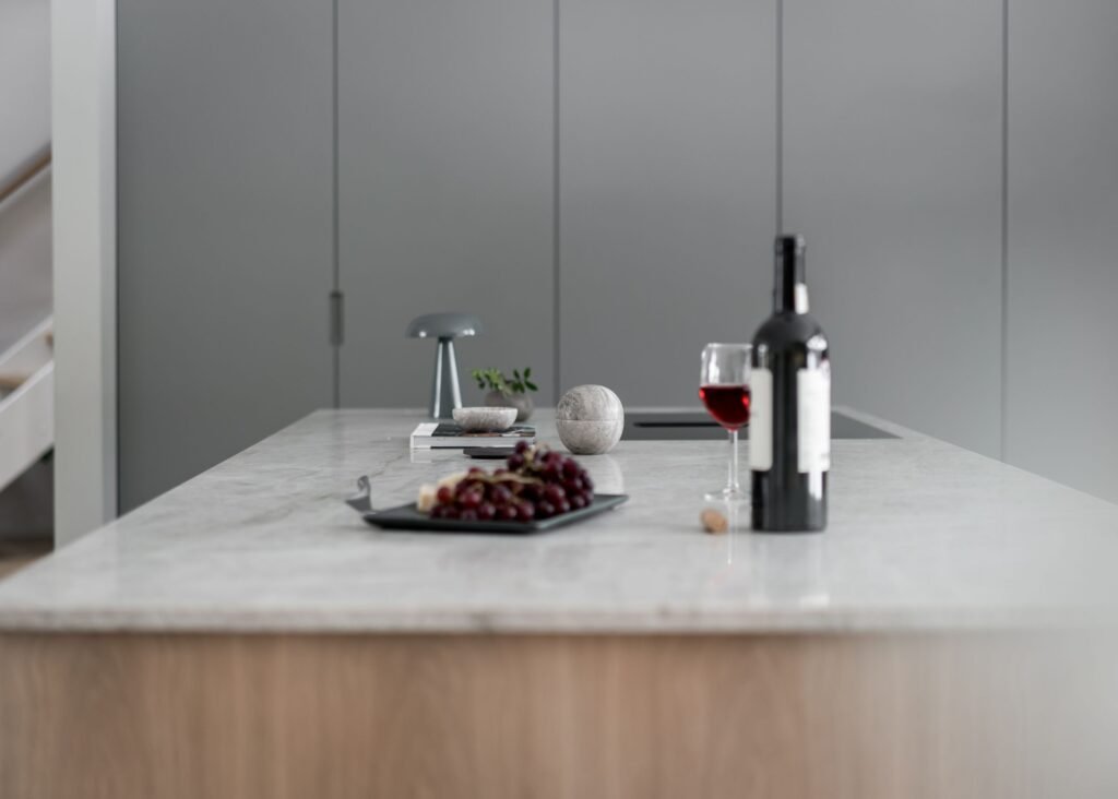
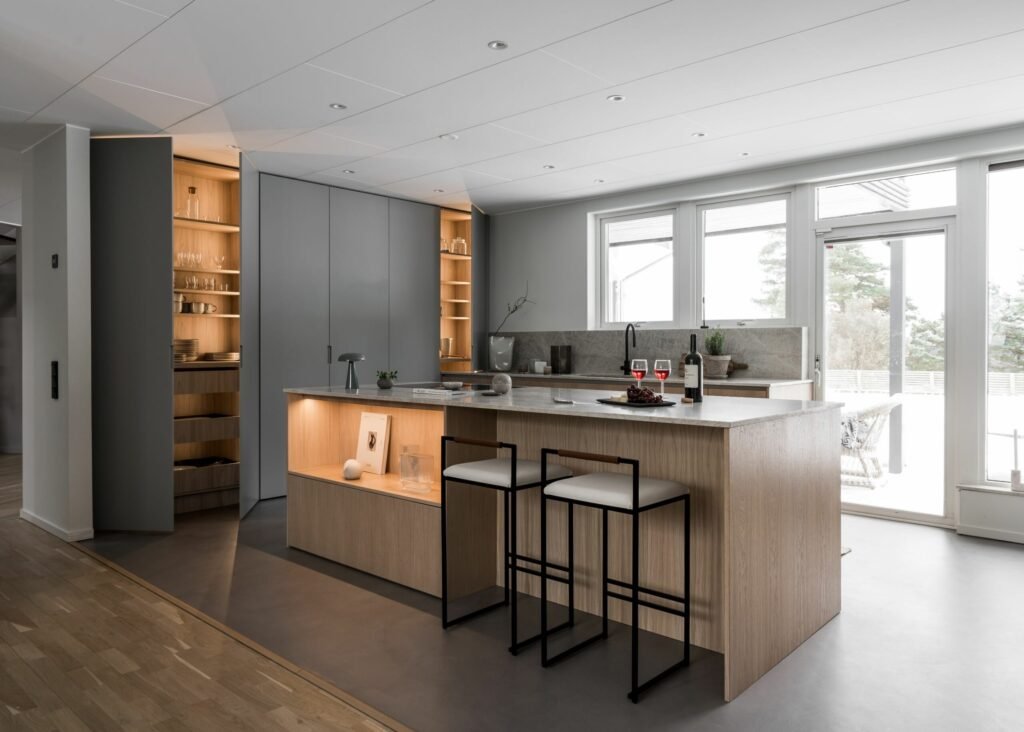
Neutral colors are a safe bet if you want to create a calm and harmonious base that is easy to combine with other colors. They suit virtually all kitchen styles and are particularly grateful if you want to build a long-term look that you can change with details.
Adapt the color to your kitchen style
When choosing a color for your kitchen, it is important that the color enhances the style you want to convey. The choice of color should not only be attractive in itself – it should also harmonize with the design, materials and expression of the kitchen as a whole. Here’s what you can do depending on the style of kitchen you have or dream of:
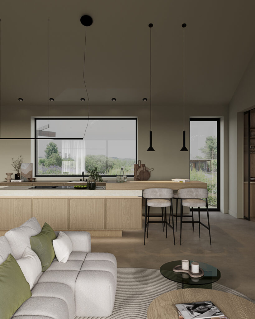
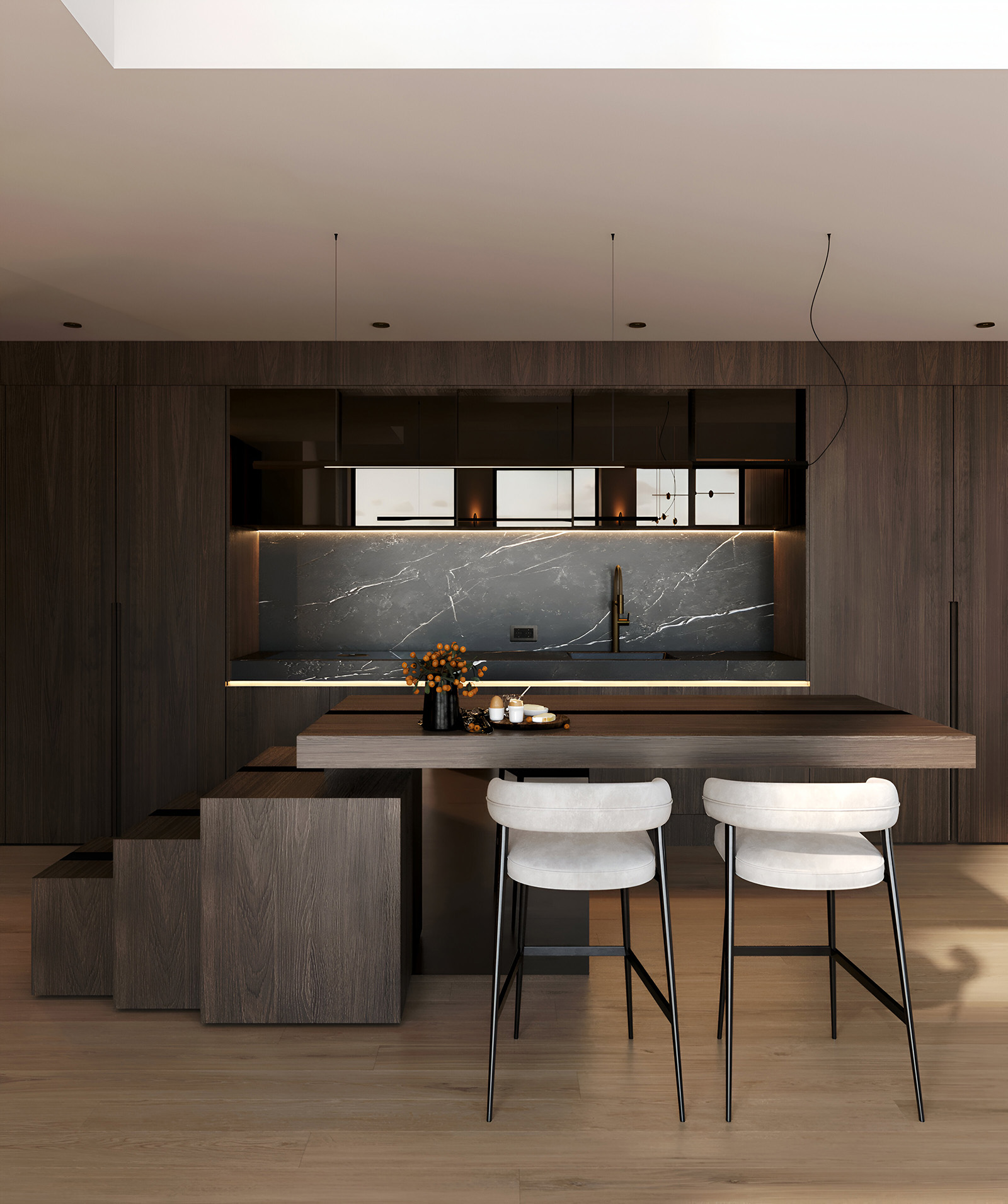
Modern kitchen
In a modern kitchen tones such as matte black, charcoal gray, graphite or muted blue/green shades work very well. Here you often want to create an austere, stylish impression – and therefore the colors should feel restrained and preferably have a slightly colder undertone. Want to soften the impression? Combine with wooden details, stainless steel or warm metals.
Classic kitchen
Colors such as creamy white, warm grey, soft beige or sandy tones are suitable here. These create a soft and timeless look that enhances the classic details of the kitchen – such as framed shutters, glazed cabinets or profiled moldings. If you want to give the classic kitchen a modern twist? Add contrasts with darker fittings or stone worktops
Luxury kitchen
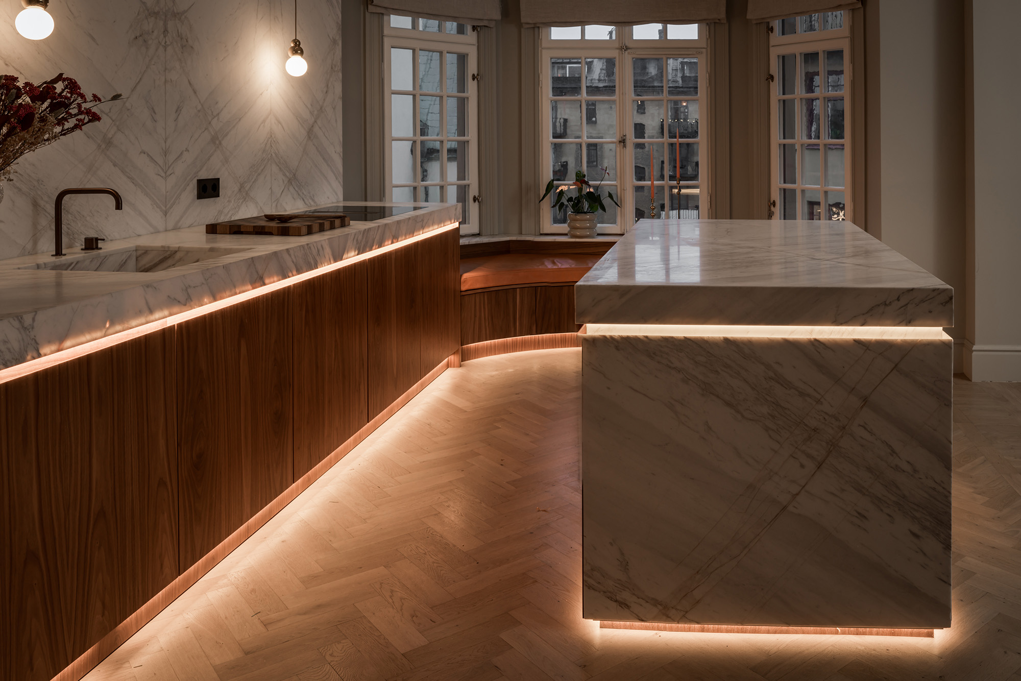
In high-end kitchens, dark colors such as dark green, dark blue, burgundy or black are often used – combined with natural materials such as marble, walnut or brass. It’s all about creating a rich, enveloping feeling – where color is an active part of the room’s identity. Make sure the lighting is well thought out so that the dark colors play with shadows and reflections.
Scandinavian cuisine
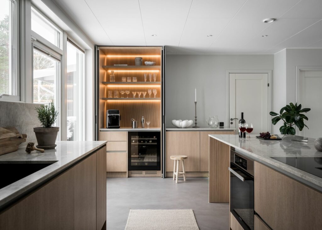
The Scandinavian look is based on light, natural tones. Choose colors such as white, grey-beige, pale green or light ash to create a soft and harmonious kitchen. Complement this with touches of wood, linen, stone and matte surfaces. Avoid sharp contrasts – let calm and simplicity do the talking.
Based on the size of the kitchen and the amount of light
Colors behave differently depending on the size of the room and how the light falls. A color that feels soft and warm in a sunlit kitchen may appear cold and muted in a north-facing room with limited light. By considering both space and light, you can choose a color scheme that enhances the room’s best features – and balances its challenges.
Color in small kitchens
In smaller kitchens, you often want to create the feeling of more space. Light and neutral colors such as cream, warm grey, light beige or soft greige reflect light and make the room feel bigger and airier.
Still want to add contrast? Try painting the base cabinets a slightly darker shade and keep the walls and top cabinets light – it creates depth without losing the room’s spaciousness.
Color in large kitchens
In a larger kitchen, there’s more room to play with deeper colors without making the room feel heavy. Colors such as dark blue, muted green, slate grey or burgundy can add weight, warmth and character – especially in open-plan layouts where the kitchen is visible from several directions.
To maintain balance in large spaces, combine the darker tones with lighter elements, such as a light countertop, white walls or warm lighting.
Lots of natural light
Kitchens with a lot of light (e.g. large windows, south-facing or skylights) offer greater freedom in color choices. Both light and dark shades work here – but keep in mind how the color changes during the day:
- Cold colors like blue and grey can feel fresh and bright in bright light, but also a bit chilly.
- Warm colors like beige, yellow and red get an extra glow in sunlight – but can be intense, so choose a muted shade if the area is large.
Limited light
If the kitchen has small windows or is located in the north, choose colors that add light and warmth. Warm neutral colors (such as creamy white, light greige, warm taupe or sand) often work best. They make the room feel more inviting – even in darker seasons.
Avoid pure white or blue tones in dark kitchens – they can be perceived as cold and shadowy. Instead, choose tones with yellow or red undertones that “lift” the room.
Think about the whole home
A kitchen should not only be beautiful in its own right – it should also fit into the wider context. Whether it’s adjacent to the living room, hallway or dining area, the choice of color affects how the whole home is perceived. Thinking holistically from the start makes transitions between rooms feel thoughtful, smooth and natural.
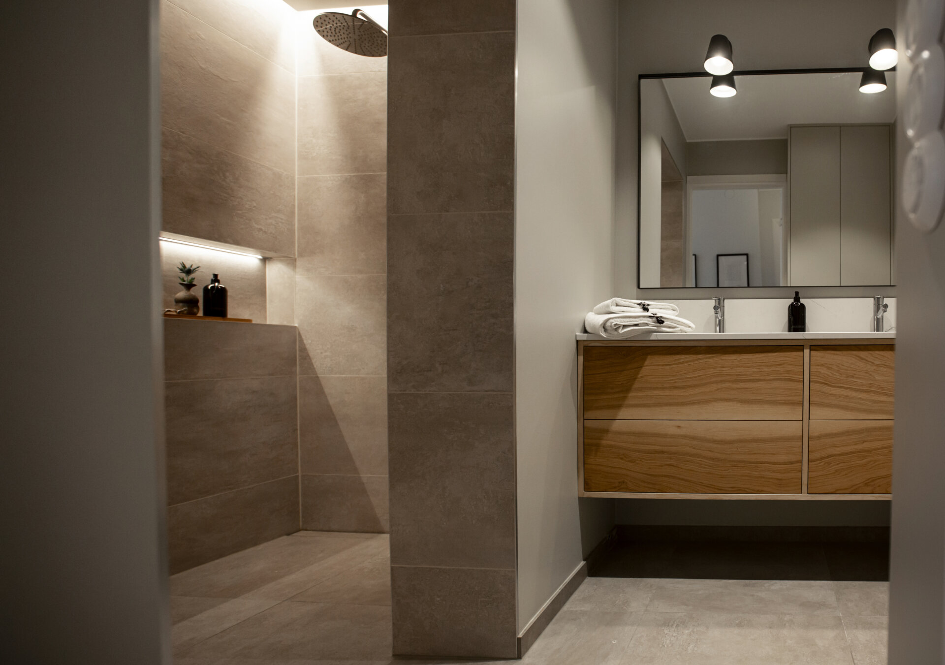
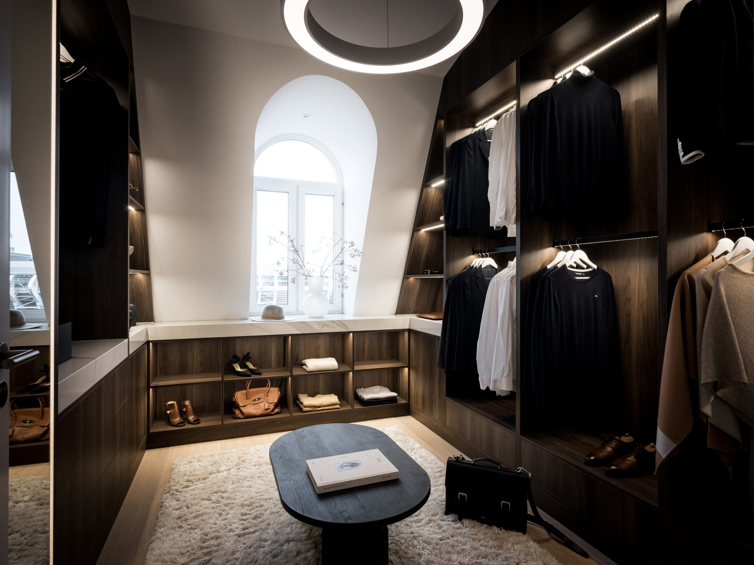
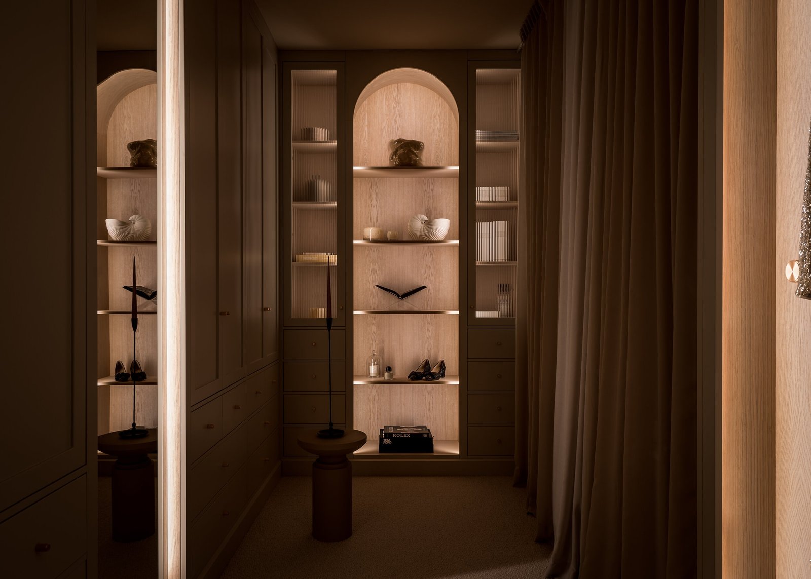
Inspiration from real projects
Explore how different color choices affect the feel – from natural tones in a bespoke kitchen to deep colors in modern solutions with a large kitchen island. All projects are designed to reflect both the home’s architecture and the client’s personal style.
Looking for more kitchen inspiration? Click through and discover our previous projects – you might just find the color palette that fits your home perfectly.